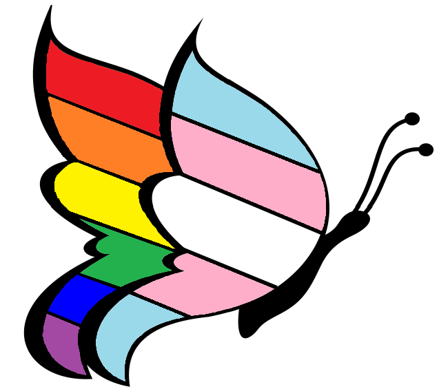
Behind the Butterfly
Starting in 2014 I started thinking of ways in which I could simplify introducing they/them pronouns when meeting
other people. It was readily apparent to me that being referred to by my correct pronouns was essential, and that
the explanations were very energy intensive. I decided that an embroidered patch would be a good way to invite
people to use my correct pronouns. While the results were mixed the logo I developed to draw attention to my
pronouns quickly became a personal sign that has layers of meaning.
Meaning of the symbols in the butterfly logo
Butterfly: Long recognized for it's natural process of transformation, I chose this base shape
to honor the times of gooey messiness that transitions often require.
Gynandromorph: I chose to make the wings drastically different colors to reflect my experience
as a
gynandromorph, a form of a species that has both female and male morphology.
Front Wing: The front wing uses the colors of the
Transgender Pride Flag
designed by Monica Helms, in acknowledgment of my transgender journey.
Back Wing: The back wing uses the colors the
Rainbow Pride Flag
to reflect my active involvement with the queer community and my complex sexual and
romantic orientations.
Black Border: I chose to include a black border because black is the traditional color of mourning
in my society. As I was developing this design I felt it was critical to honor
those who died too young to violence or suicide stemming from our societies failure
to honor their journey and experience.
 On Servants Wings